Northwest Stamper

Tag: neutrals designer paper stack

  • Pretty Kitty Card – Coloring with Markers

    I saw this general card idea from Shannon Jaramillo a while back when I needed some inspiration for a card.  But as I usually do with cards, I took some of my favorite elements from the card, and then tweaked some of the other details to get to use some of my favorites too!

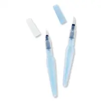
    I wanted to focus on the cute kitty from the Pretty Kitty stamp set, and all of the images from that set are outline images – so they just BEG to be colored in!  And so I went with the easiest way to color, my Stampin’ Write markers.  These are Stampin’ Up’s markers and they have the exact same ink inside the barrel of the marker as there is in the ink pads.  So it makes them great to color with, since you know they will match your project.  In this case, however, I wanted to add the pops of color, so I used a variety of markers to fill in my flower pot.

    Coloring Tips:

    • Picking your paper – When coloring with markers, you aren’t getting your paper quite as wet as when you are watercoloring, so Whisper White is perfect for using with markers.  That way your colors are the truest to match the rest of your project.  You can color with markers on watercolor paper or other cardstock, basically anything that you can stamp on without it wiping off, you can color on.  So things like window sheets – not so much. Smile
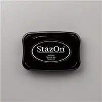
    • Picking your stamped image ink – Again, since your project doesn’t get as wet, you can use most inks.  However, keep in mind that if you are using dye-based ink (so basically any of the standard color pads from Stampin’ Up), that your markers are the same dye-based ink, so they can smear a bit if you aren’t paying attention.  I find that Stazon, Memento, or Archival Black or Gray ink work best.  Because these are hybrid (or alcohol based in the case of Stazon) inks, they can hold up to the dye-inks without trying to mix in.
    • Picking your marker tip – The Stampin’ Up markers have a pen tip on one side and a brush tip on the other.  I find that the brush tip gives the darker application of color (since more ink can come out) and tends to be a little bit smoother on large areas.  The pen tip tends to come out a bit lighter and is great for precision work, highlighting, or when you want to write out a message.  So, in this card, I colored in the flowers with the pen tip and the pot with the brush tip.
    • Make it art, not perfect! I purposely made the coloring streaky so that I didn’t have to worry about things being perfect.  Instead, I did everything a little bit scribbly with back and forth lines.  That way, if I didn’t get one area exactly perfect, it still matched with the rest of the coloring and it all looked designed instead of a mistake!  In wide open areas, you will find that your coloring looks the best if you can color with long strokes with the brush tip of the marker.

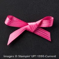
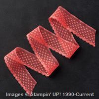
    Once the coloring was done, then I used my Layering Ovals to cut out the kitty and backed it with a Real Red scalloped oval from the same die set.  See… I didn’t believe in the tiny scallops at first, but I’ve come to think they are just adorable!  Then I wanted to add a bit of my FAVORITE ribbon from the holiday catalog (grab it while you can and it’s 50% off!), the Stitched Edge Real Red ribbon.  A few more scallops never hurt anyone, right? Smile

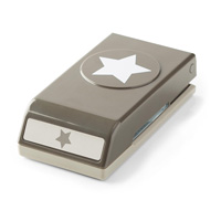
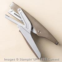
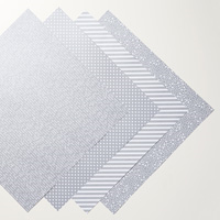
    Then I just needed to add a sentiment and so a quick banner punched with the Banner Triple punch to get the perfect cutout at the end was all I needed!  The sentiment comes from the Pretty Kitty stamp set, so I had everything I needed!  Layer it all onto some of the polka dot paper from the Neutrals designer paper stack and some white and red cardstock and you end up with a pretty card with a pretty kitty.

    December Hostess Code – FUYTBWNK

    NWstamper signature_thumb[9]

    order online button for sig 3_thumb[4]

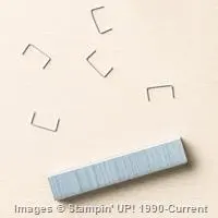
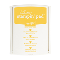
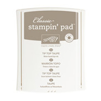
    Project Supply List – click any image to see it in the online store!

  • Easy and Classy Watercoloring with Remarkable You

    As I go to post this picture, I realized that if it was a poppy, it would have been even more perfect for Veteran’s Day today.  But that is ok… it is still fair to say to all the men and women who have joined our Armed Forces and been willing to do what is needed to protect our country and folks who cannot protect themselves around the world… thank you.  You are remarkable!

    Isn’t this such a pretty card!  It just makes me happy when I see it.  And I’ll tell you, I can’t really take the credit for it.  While I did make this copy you see here, it is a CASE from the lovely Diane Dimich and you can see her original here.  But I needed an idea for card class and wanted to use this stamp set because I LOVE watercoloring with it, and I just loved the colors and how easy to put together this card is.

    Tips for making this card:

    • One of the best things about this card is how easy it is to put together… here is all you need for it:
        –  Basic Black cardstock for the base – 5 1/2’ x 8 1/2”
        –  Whisper White cardstock – 4” x 5 1/4”
        –  Polka Dot designer paper from the Neutrals Designer Paper stack – 1 3/4” x 5 1/4”
        –  Melon Mambo stitched satin ribbon – 6”
    • Just adhere the designer paper to the bottom of the Whisper white cardstock and then wrap the ribbon over the seam before adhering to your card base!
    • When you are doing watercoloring, you will want to stamp your image onto Watercolor Paper – this is a special type of paper that is thicker and the fibers are designed to be able to handle lots of water going over them without the paper pilling up or wearing a hole through. 
    • And make sure you are using Staz On ink for your stamping!  You don’t want the ink to start bleeding into your image as you are coloring. Smile
    • Once you’ve stamped your image, you can just start layering on the color until it looks the way you want.  YES!  You can go over the same area over and over again to get it darker if needed.
    • TIP – if you’ve never done watercoloring before, it is really easy!  Here is what you need to know:
        – Start by stamping your image onto watercolor paper with StazOn ink (both are available in the Stampin’ Up online store)
        – Take the ink color you want to color with and SQUEEZE the ink pad so that ink transfers to the TOP of the ink pad
        – Open your ink pad and use an Aqua Pen and use it like a paintbrush to pick up the color from the lid – NOT from the surface of the ink pad.  You don’t want to pick up the ink from the ink pad because you will end up diluting the ink in your pad and getting funny spots where you were getting the ink. Smile
        –  Brush on your color over your image and repeat until you get it looking how you’d like.  If your color isn’t spreading on smoothly when you are coloring, squeeze the barrel of the Aqua Pen slightly to get more water to the tip of the brush.
    • After you like how it looks, we just cut it out and adhered to the front of the card using dimensionals.  Add your sentiment and some rhinestones and it looks great!

    Fun and easy, right?

    Don’t forget the savings on my Flurry of Wishes Class by Mail!  Through Monday 11/16!

    Just a reminder that since the Snow Flurry punch is on sale this week as part of the weekly deals, I’m passing the savings on to you with my Flurry of Wishes Class by mail!  Purchase either the class kit & punch or the best value bundle and I’ll take $4.50 off your class fee! 

    Sign up here!

    NWstamper signature_thumb[9]

    order online button for sig 3_thumb[4]

    But use Hostess Code PU2EYZJY to get a special thank you from me!

    Project Supplies Used:

  • Walkthrough Wednesday – Clean, Simple, and a little bit Funky 2015 Convention Card Swap

    Every year I go to the Stampin’ Up Convention in Salt Lake City and it is the highlight of my summer.  I mean, come on – getting to spend 3 days being surrounded by amazing creative ideas and even more creative men and women?!  What isn’t to love about that?  I always come away recharged and excited and filled with so many ideas.  And this year is no exception. Smile 

    Now, before I go, I always create some amount of swap cards.  Often I will make multiple designs because goodness knows I don’t have the patience for actually making 100 of the same card!  This year, I participated in 3 organized swaps and then made extra of those designs to swap out and about with random people.  This was my absolute favorite and also my last minute card too!  I literally designed and cut for it about 12 hours before my flight left for Salt Lake City! 

    It is quick to make and yet still has a lot of personality, which I love.  So I wanted to share it with you AND I have a Walkthrough Wednesday video tutorial below so you can see how to make it step by step.

    Tips for making this card:

    • Start with an idea that grabs you and build from there! 
      In my case, I really liked the idea of using the Sunburst from the Kinda Eclectic stamp set and having a Gold Foil Star in the center and then I started adding more paper and ribbon from there.
    • Don’t feel like your ribbon colors have to be a traditional match.  Mix and match and you’ll be surprised how fun things can turn out.  I used the Watermelon Wonder dotted lace trim and then added a layer of designer paper and a finishing touch of the Bermuda Bay sequin trim.
    • Find common elements to pull everything together.  Like in this case, I have gold sprinkled throughout and I have “shiny” too!  The paper and the star are both gold and the sequins tie in to the star by being shiny!
    • When trying to attach lace trim and paper, the tape runner (like the Stampin’ Up SNAIL work great) but for sequins, I prefer to either use glue dots to hold the ends down, or use a mini stapler to attach the ends.
    • If you can’t tell, Stampin’ Up has done something new with their Neutrals Designer Paper stack this year and has added in Gold and Silver metallic papers.  I like that they are metallic without looking like foil so I can add it in without it overpowering my projects.  It is really cool paper!

    Want to see how it all comes together?  Check out this video I put together to walk you through step by step with dimensions and all the great tips you expect along the way. Smile


    (note – if you are reading this post in email, you can get to the video here)

    Need any of the supplies so you can make this yourself?  (You can’t go wrong with any of the items I used in this card this week… they are all favorites that I totally recommend!)  You can find them all in my Online Store or click any of the pictures below to learn more about any of the supply items.

    Thanks so much for stopping by! I  hope you’ve been enjoying the Walkthrough Wednesdays… I’m looking at ways to change and improve my blog posts and ways I share my projects and so hopefully I’ll have more fun stuff for you soon. Smile 

    NWstamper signature_thumb[9]

    order online button for sig 3_thumb[4]


    Project Supplies Used: